I’m very interested in user interface (ui) design and user expereice (ux) design.
Recently, working on my new ipad app synthmate, the most interesting part has been reflecting on the progress of the app’s ui/ux and learning from what elements stayed and what elements changed from my initial design/ideas.
Wireframes or mock-ups were done using flash. I like using flash because i know it and i like the way you create objects inside other objects. I can easily switch between assets and generally work fast and am able to constantly tweak. The assets i used were grabbed off the web and screen shots of the ipad simulator. I should say i also don’t like flash for numerous reasons but i won’t go into them here.
Here’s my first mock-up
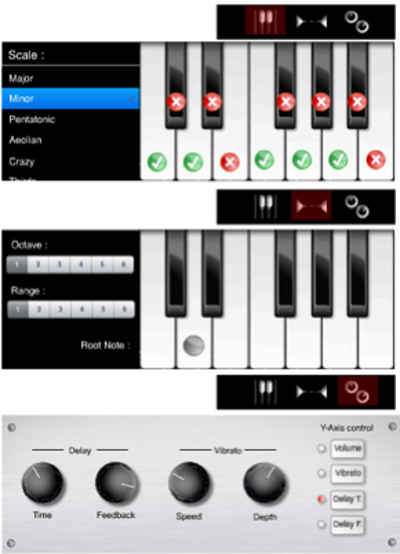
Some of the things i didn’t like about this first draft were :
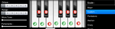
- duplication of the keyboard image. i felt user’s would probably get confused between 2 pop-overs looking very similar. I tried to put scale and scope together (below) but i felt there was now too much for the user to work with.
- I liked the idea of making rotating controls and had a nice looking image BUT i made one and it was terrible. I soon realised that trying to simulate “real world” controls on a “virtual world” device is often a gimmick and not very user friendly. I knew this from using many applications including digital mixing desks for live audio and now that i had made one, i understood why they don’t work. So, i went for a more modest slider control, apple’s built-in one. I dressed it up to blend in with the other controls and set the thumb and slider size to both be large enough for a finger to touch and to also show the min and max.

- I felt the green ✓’s and red ✗’s were over-kill. Very busy. The more i thought about it the more i realised that in fact what i was trying to show was not a keyboard at all. For those musicians out there, setting the scale keyboard to say D Major and then setting the Root note to say E would mean you would be playing E Major. Very confusing. To solve this, i came up with what i was really trying to represent; the notes within ANY scale. The solution was so simple and it also meant i now only had 1 keyboard image, representing the Root note.
- The control surface is a whole other post. I’ll edit the screen capture movies into a quick history of its development.
I love my mock-ups. They help me see what my app is going to do. And it separates writing code and designing ui/ux. Of coarse it’s hard to separate from writing code and there are always tweaks to be made. I find having a good clear idea makes writing the code a lot more fun because it’s satisfying to achieve what you set out to achieve. WIthout a plan or a rough idea of something can also be fun, with some lovely results. But it doesn’t always work.